Reimagining Frank Gehry's Cafeteria

NYC’s Iconic Publishing Fortress Transforms into an Oasis of Human-Centric Lighting and Design with Color Select® Tunable White
It’s a new era in midtown New York City, as the “Devil Wears Prada” ethos gives way to wellness, community and sustainability. Owned by The Durst Organization, One Five One (151 West 42nd Street) was known as the home of the Conde Nast publishing empire and its ultra, exclusive Frank Gehry designed cafeteria – accessible only to Conde Nast and their treasured guests. It was the place where some of the most influential magazine editors like Vogue’s Anna Wintour and Vanity Fair’s Graydon Carter could be found whispering over gourmet entrees in a backdrop of strikingly curvaceous glass panels. The glossy publishing house has since moved downtown, leaving Frank Gehry’s signature architectural elements behind and opening a new era for the illustrious cafeteria to reintroduce itself as a shining example of the latest trends in interior design and personalized lighting with USAI Lighting.
THE CONCEPT
The visionary building owners seized the moment as an opportunity to capitalize on a growing trend in real estate development where the lines between residential and commercial spaces blur, and living healthy productive lives becomes the new mantra. The Durst Organization envisioned repositioning the once exclusive cafeteria into a building-wide amenity space that is communal and human-centric by design – providing a convenient escape into a community oasis that is conceptually far away from the hustle and bustle of Time Square and the high-powered corporate offices within. Fueled by their newly formed brand, Well&, and in collaboration with Studios Architecture and Loop Lighting, the footprint expanded to the entire floor and transformed into a 45,600 square-foot farm-to-table artisanal food hall, café/wine bar and flexible meeting, hospitality and events space where people can work, play, live and thrive with a signature amenity experience elevated by the subtleties of human-centric lighting and design. Studios Architecture and Loop Lighting partnered to reimagine the space with the Frank Gehry elements as its crown jewel.
CHALLENGES
The Durst Organization presented the design team with their new vision for offering the latest in workplace amenities guided by a commitment to promote wellness, community and sustainability to their tenants, along with an understanding to integrate Frank Gehry’s architectural forms and designs for the new artisanal food hall. The challenge was two-fold:
1) Create a flexible environment that supports varying activities as they change and progress through the course of the day, tapping into emotional cues for an elevated personal experience (morning coffee to evening drinks).
2) Integrate the Frank Gehry curved architectural elements (glass panels and column/walls) in a way that creates a sense of visual connectivity through an expanded floor plate that did not exist in the original design.

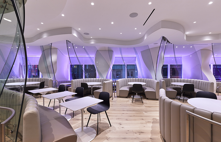
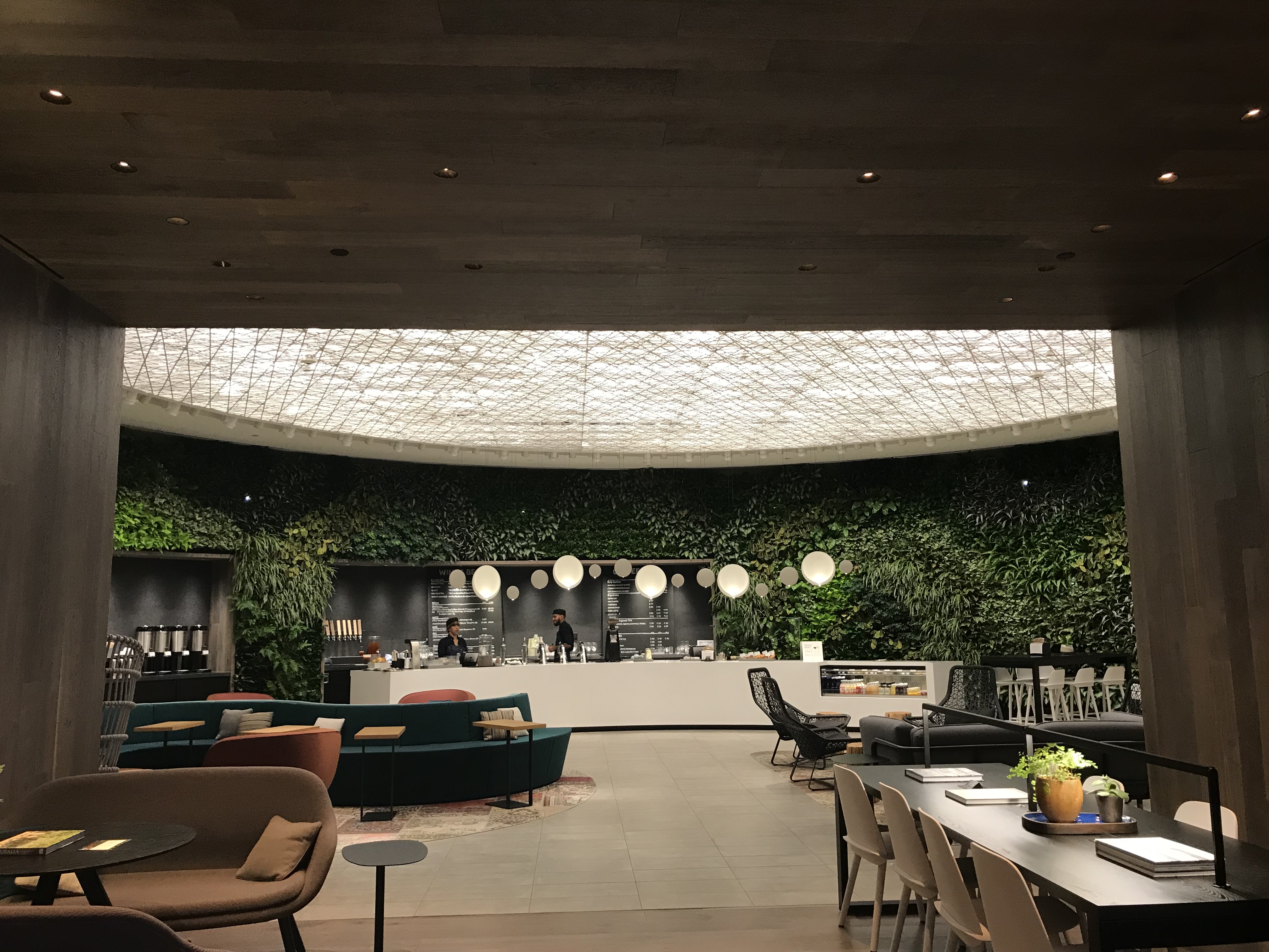
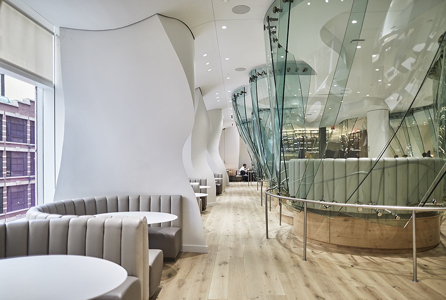
THE SOLUTION 1: Creating a flexible environment that enhances how we work, play, live and thrive. The interaction of color, light and texture influence how we respond and interact in an interior space. Originally designed with 4 private dining areas and styled with curving, dark, inky-blue titanium walls, orange tufted booths and taxi yellow table tops, the Frank Gehry cafeteria had a more compartmentalized, darker, moody feel. Now with a more expansive floor plan and an intent to encourage social interaction amongst the professional community within the Manhattan high rise, as well as quiet nooks, the design team took a more contemporary biophilic approach to bring the comforts of natural outdoor elements in. White American Oak floors with white table tops, white plastered curving walls and luxuriously soft, dove grey leather booths brighten up and transform the former Frank Gehry Cafeteria into a luxurious artisanal food hall. A dark wood portal known as “The Library” creates a warm, quiet sanctuary leading to a more social area known as “The Green” – an open outdoor-like coffee/wine bar garden area outfitted with a large floor-to-ceiling 180 degrees green wall filled with over 2000 plants.
Using Color Select® tunable white LED light technology and its ability to mimic the sun’s natural light, Loop Lighting designed personalized light scenes with varying color temperatures and intensities to allow the space to visually evolve and evoke emotional responses aligned with daily events occurring throughout the food hall, and coffee/wine bar - morning to evening. Layered in with dynamic lighting accents, John Newman and project manager, Esra Aras created an inviting space that changed every time you entered through the course of the day yet provided a consistent daily light cycle to provide familiarity.
A Light Cycle to Enhance How We Live.
- 6AM – 7AM. Set Up + Coffee. Lighting for a gentle wake up as people slowly saunter in. The food hall is partially opened serving coffee and teas, setting up for full service. A morning sunrise is the inspiration with tunable white light set with an incandescent-like warmth of 2700K. Dynamic orange-amber accent lights are layered in.
- 7AM. Breakfast. Food hall is fully opened and a warm neutral white of 2900K shines throughout the space.
- 12PM. Lunch. As lunch time arrives, dynamic orange tonalities give way to lighter blue, clear skies. White light is tuned up to an energizing cool white with 3700K.
- Mid Afternoon. Afternoon sets in and the color temperature begins to slowly transition down to 3200K. Light blue dynamic light deepens into saturated blues to create an ambient layer.
- 5 – 6PM. Happy Hour. It’s the end of the day and people are ready to unwind with conversation and a drink at the bar. White light returns to the warmth of 2700K and dynamic light is layered in with festive accents of rich magentas to create a social environment.
- 6PM – 10PM. Lounge. The space transforms into a bar scene with white light tuned down to candlelit levels, accented with intense dynamic lighting to create a space perfect for mingling and buying a few rounds of artisanal cocktails for your colleagues and clients.

While lighting a space, it’s important to consider textures, materials and colors. Choosing the right light will allow finishes to look their best and align with the design intent. “The Library’s” dark wood finish required warm color temperatures to illuminate the warmth in the millwork. For this space, Newman developed a lighting design that cycled with a narrow variation. It moves from a warm 2500K, to a medium warm 2900K, and back to a warm 2500K – creating a cozy, quiet space that evolves elegantly through the day.
THE SOLUTION 2: Lighting to create visual connectivity with a masterpiece. Originally, the Frank Gehry curved glass panels and perimeter walls within the Conde Nast Cafeteria lived in its own space without a great deal of visual connectivity. The client wanted a space where people could circulate through and wanted the team to respectfully integrate Gehry’s work into the overall design.
“With a much larger floor plate, we weren’t looking at one room. We were looking to solve a design problem that reimagined the one-of-kind architectural element and weave it through the new food hall, dining area, café, meeting spaces and other areas,”
-John Newman, Partner at Loop Lighting
Originally unveiled in 2000 as Frank Gehry’s first architectural structures in New York City, the extraordinary 12 ft high x 4 ft wide, 800 pounds, wavy glass panels have become historical examples of exquisite contemporary architecture. Extremely fragile and precious, they came with a great deal of responsibility for the client and design team to strike a balance between reinterpreting and preserving.
Each of the curved column/walls flow elegantly from the floor to the ceiling. The complex nature of illuminating these organic curvatures within the outer perimeter along with the curved glass panels centered in the middle of the room required a number of on-site mock ups for the dining space. This involved the use of track and spot lights coupled with fixtures that offered the flexibility of multiple beam spreads and angle options to easily test varying approaches quickly. There was an expectation from the design team that the curved perimeter walls would be lit directly. Through a great deal of experimentation, Newman and Aras learned that direct lighting only highlighted portions of the curvaceous element. They discovered the winning strategy was to Illuminate lighter surfaces that were not part of the signature forms. This approach was unexpected and bewildered the rest of the design team. Newman explains,
“Using BeveLED Mini Color Select LED adjustable downlights with its varying beam distributions aimed on the white table top surfaces and the White American Oak floors, allows us to effectively introduce a soft uniform and indirect light level that gently lights all of the curves in the irregular form – honoring what we interpret as the original design intent by Frank Gehry. It was quite difficult. We couldn’t model it in computer simulations effectively. It was too challenging to explore what the light was going to do through rendering. So, we climbed up on ladders and explored… ‘Let’s see what happens when we direct light at the curve down here, or get closer, or just light the table…’ That was part of the design that no one expected, and it was important to have the versatility of BeveLED Mini adjustable downlights to facilitate experimenting different options.”
Everyone on the design team had a respect for the project and realized its value in terms of its architectural contribution to the building and space. It was important for the lighting design to support Frank Gehry’s work, while modernizing the space as a premiere example of how personalized lighting can enhance wellness, encourage community, demonstrate sustainability and elevate everyone’s experience.
Related Products

BeveLED Mini Complete
- 3" Aperture Round or Square
- 500 to 2500 Delivered Lumens
- Trimmed/Trimless/Millwork
- 6° - 65° Beam Options
- Declare Label Red-List Approved

|

|
Tweet |


